Redoing the level
Hello everyone!
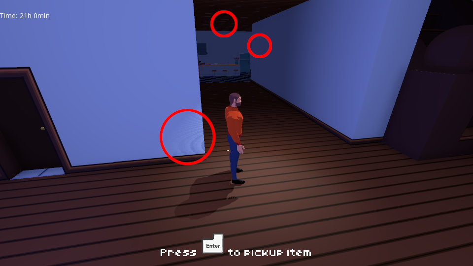
Here’s another devlog for the game. I have been working primarily on recreating the level mesh in Blender. Before I used the Gripmap feature of Godot to create the level from various small elements. But I notices some shadow artifacts, if dynamic light sources are used.

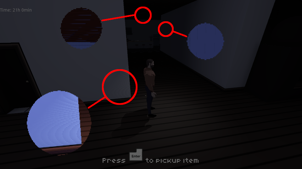
And here in closeup:

These seem to be unavoidable in the Godot 3 render pipeline, if
you want to use some of the advanced lighting options with gridmaps.
So I spent the last two weeks remodeling the house in Blender. After
that I had to reapply collision shapes and move the furniture in
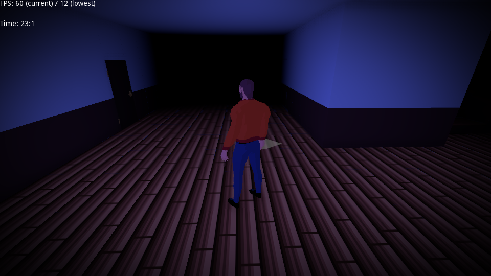
Godot. Here’s a sneak peek of the new model:

As you can see I'm also changing the the overall look of the level a bit. New textures, more space and (hopefully) better readability. I've used many white/gray colors in the past and it made it hard to read the overall structure of the building. That made "places to go" seem like dead ends. I'm still experimenting, but what do you think about the changes made so far?
I still need to fix some (new) graphical glitches and thoroughly test collision. Up until now I have mostly worked on core
systems and improving/redoing assets. But for the next update I also
want to have a bit more to offer in terms of gameplay. New game events and an experience closer to the actual gameplay I aim for.
That’s why the release of the 0.1.1 version will take a bit longer. I’d like to still release the next version this year, but only if I’m satisfied with the result.
Thank you for reading!
Get A Home in Darkness
A Home in Darkness
A DOS-inspired horror game in which you learn and perform rituals to defend yourself against supernatural beings.
| Status | In development |
| Author | Martin Senges |
| Genre | Adventure |
| Tags | 3D, DOS, Horror, Low-poly, Magic, MS-DOS, Singleplayer, Third Person |
| Languages | English |
| Accessibility | Configurable controls |
More posts
- Version 0.9.04 released with MacOS build!Aug 31, 2024
- Version 0.9.03 releasedAug 10, 2024
- Version 0.9.02 releasedAug 08, 2024
- Version 0.9.01 releasedJul 27, 2024
- 0.9 Release - but not the kind you think ofJul 12, 2024
- Thanks for all your helpJun 10, 2024
- Price increase, Page update and potential release date of version 0.9May 19, 2024
- Source code availableMar 10, 2024
- Where is version 0.9?Nov 04, 2023
- Version 0.8.0 is out!Nov 23, 2022

Leave a comment
Log in with itch.io to leave a comment.